This lesson covers the creation of menus in the Zilch Engine.
Learning Objectives
- Using Zilch's UI system to create graphical menus
- Learning how to use a button interface to switch between levels
Level Setup
- Command : New Project
- Create a new project using the {nav icon=clone, name=Empty 2D Project} template
Making a menu, HUD, or simple title screen in Zilch is easy when you start with the built-in UI level template. Let's make a simple game with a title screen, a main menu, and a basic gameplay level.
(NOTE) What's a Widget? In this tutorial, you'll encounter the word widget. In short, a widget object is a UI element. Zilch widgets object include //points of interaction//, like buttons and sliders, as well as static elements, like text labels and layouts containing other widgets object. What all widgets object have in common is the UiWidget component, which each one has. All graphical user interfaces (or GUIs) created with Zilch's UI system, whether they're title screens, main menus, or anything else, are composed of widgets object.
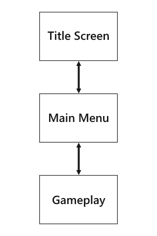
We'll start with the title screen.
Creating a Title Screen
- Command : Add Resource
- Create a Level resource using the {nav icon=clone, name="Ui Level"} template and name it
TitleScreen
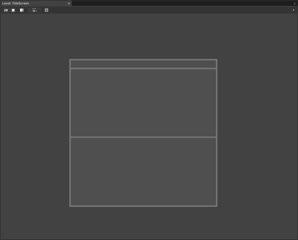
The UI level template includes a RootWidget object object, complete with all the special components that make it tick, such as UiRootWidget and UiRenderer. It also comes with a few placeholder sprites that we won't be using.
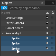
- In the
Objects Window - Under RootWidget object
- Select : the three Sprite object objects
- Command : Delete
Our title screen will consist of white text against a dark background. The background color can be changed through the RootWidget:
- Select : RootWidget object
- In the
Properties Window - Under UiRootWidget
- Set LocalColor to
[R:36, G:36, B:36, A:1.00] - Remove Component : UiStackLayout
- Add Component : UiFillLayout
It's time to make our first widget object: a text label. The best way to make widgets object is to instantiate them from archetypes, and Zilch comes with some archetypes that are just for use in UI creation. These can be found in the Library Window, but you'll have to change libraries to find them.
- In the
Library Window - Open the Library enum list menu
- Select the
UiWidgetlibrary
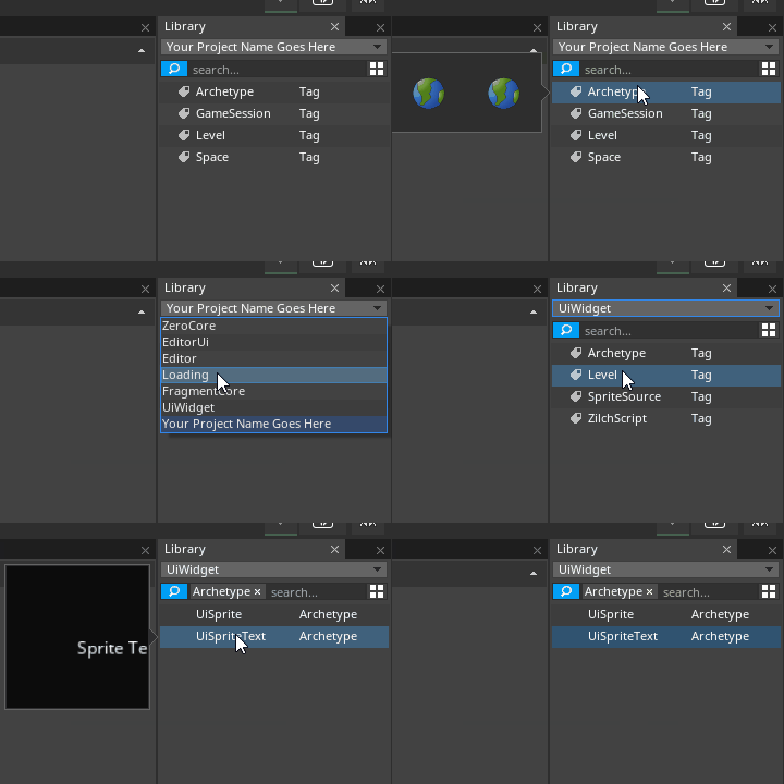
- In the
Library Window - Under Archetype
Left dragUiSpriteTextinto theObjects Window- In the
Objects Window Drag and droptheUiSpriteTextinstance on top of RootWidget object
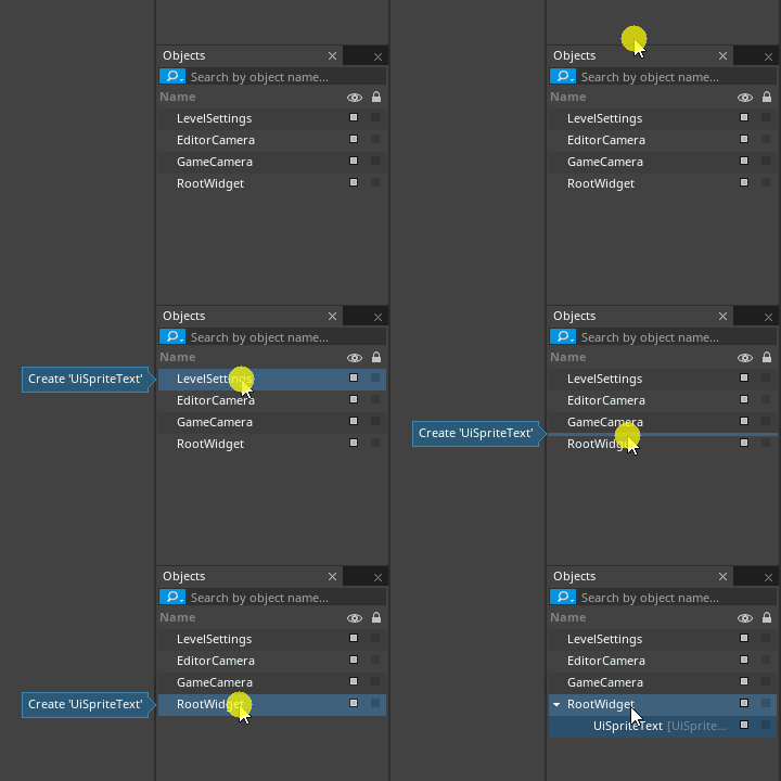
- In the
Properties Window - Rename the UiSpriteText object to
Title - Under UiWidget
- Under the Layout group
- Set HorizontalAlignment enum to
Center - Under SpriteText
- Set TextAlign enum to
Center
NOTE: The UiWidget component's VerticalAlignment and HorizontalAlignment properties determine where the text widget object's area is positioned within its parent layout (in this case, the RootWidget object). The SpriteText component's TextAlign property, on the other hand, determines where the text itself is positioned within its own area.
- In the
Properties Window - Under UiWidget
- Set the Y part of Size to
50 - Under the Layout group
- Set SizePolicyX enum to
Flex - Set MarginTop to
180 - Under SpriteText
- Set Font enum to
NotoSans-Bold - Set FontSize to
36 - Set Text to something pretentious
(NOTE) Why Just Y? Normally in our tutorials, when we want you to set just one part of a vector-type property, we direct you to set the whole thing at once (for example, //Set Translation to [0, -5, 0]//). But above, you are explicitly directed to set just the Y part of the Size property. The reason is that, a few lines later, when we set the SizePolicyX enum property to Flex, it causes the parent layout to "take over" the X part of the Size property, meaning that any changes that we made to it would overwritten immediately. You'll see this sort of thing throughout Zilch's UI system and our tutorials covering it.
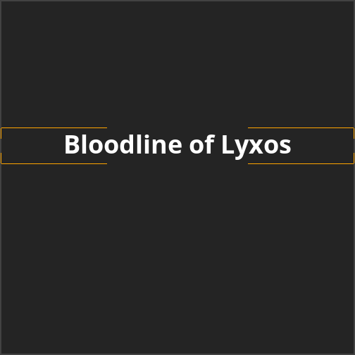
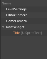
Title screen so far, with hierarchy for reference
- Select : Title object
- Command : Duplicate
- Select : the new copy of Title object
- In the
Properties Window - Rename the copy of Title object to
Subtitle - Under UiWidget
- Set LocalColor to
[R:255, G:255, B:255, A:0.50] - Under the Layout group
- Set MarginTop to
215 - Under SpriteText
- Set Font enum to
NotoSans-Regular - Set FontSize to
24 - Set Text to something longer and perhaps more pretentious
- Under UiWidget
- Set the Y part of Size to
33
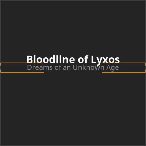
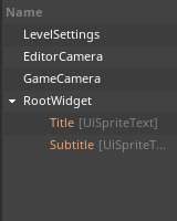
Title screen, continued, with hierarchy for reference
- Select : Subtitle object
- Command : Duplicate
- In the
Properties Window - Rename the copy of Subtitle object to
StartText - Under UiWidget
- Set LocalColor to
[R:255, G:255, B:255, A:1.00] - Under the Layout group
- Set VerticalAlignment enum to
Bottom - Set MarginTop to
0 - Set MarginBottom to
180 - Under SpriteText
- Set Font enum to
NotoSans-Bold - Set FontSize to
16 - Set Text to
Click to Start - Under UiWidget
- Set the Y part of Size to
22
The StartText object says //Click to Start//, but of course clicking won't do anything yet. We'll add that functionality soon, but for now, there's just one more finishing touch to apply to the appearance of the title screen.
- In the
Library Window - Under Archetype
Left dragUiSpriteinto theObjects Window- In the
Objects Window Drag and droptheUiSpriteinstance on top of RootWidget object- In the
Properties Window - Rename the UiSprite object to
HorizontalLine - Under UiWidget
- Set the Y part of Size to
2 - Set LocalColor to
[R:255, G:0, B:0, A:1.00] - Under the Layout group
- Set SizePolicyX enum to
Flex - Set MarginLeft to
20 - Set MarginTop to
218 - Set MarginRight to
20
(NOTE) Hierarchy Render Order: If your game's title contains a letter that has a descender (such as a lowercase //y//), the red horizontal line will be rendered on top of it. To correct this, just move the HorizontalLine object object to the top of its hierarchy in the Objects Window: 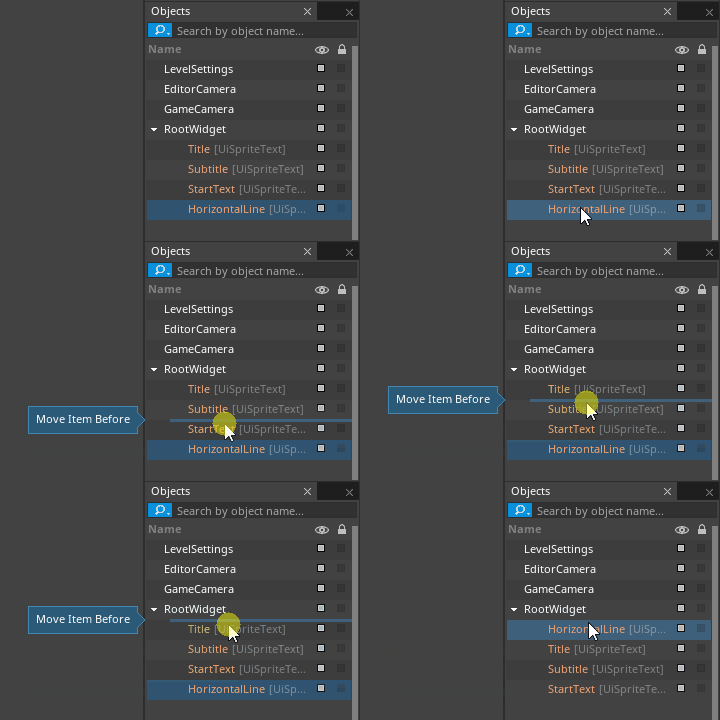 This works because, while hierarchy order doesn't affect the way that widgets object are laid out in a
 UiFillLayout, it does still determine the order in which Sprites and SpriteTexts are rendered by a UiRenderer.
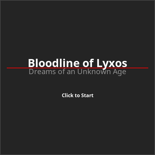
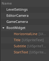
The complete layout of the title screen, with hierarchy for reference
Now for the main menu.
Creating a Main Menu
The main menu should contain four buttons:
Start Game, which loads the gameplay level
Credits, which loads the credits level
- The credits level should contain a Return to Main Menu button, which loads the main menu level
Return to Title, which loads the title screen level
Quit Game, which exits the game
Let's get started.
- Command : Add Resource
- Create a Level resource using the {nav icon=clone, name="Ui Level"} template and name it
MainMenu - In the
Objects Window - Under RootWidget object
- Delete : the three Sprite object objects
- Select : RootWidget object
- In the
Properties Window - Under UiRootWidget
- Set LocalColor to
[R:64, G:25, B:25, A:1.00] - Remove Component : UiStackLayout
- Add Component : UiFillLayout
- In the
Library Window - Under Archetype
Left dragUiSpriteinto theObjects Window- In the
Objects Window Drag and droptheUiSpriteinstance on top of RootWidget object- In the
Properties Window - Rename the UiSprite object to
MenuWindow - Under UiWidget
- Set Size to
[200, 250] - Set LocalColor to
[R:255, G:255, B:255, A:0.10] - Under the Layout group
- Set VerticalAlignment enum to
Center - Set HorizontalAlignment enum to
Center - Add Component : UiStackLayout
- Under UiStackLayout
- Set PaddingLeft to
4 - Set PaddingTop to
4 - Set PaddingRight to
4 - Set PaddingBottom to
4 - Set Spacing to
[0, 4]
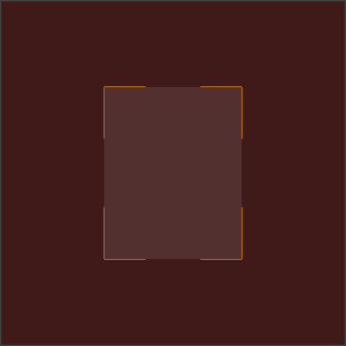
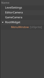
Empty menu window for the main menu, with hierarchy for reference
- In the
Library Window - Under Archetype
Left dragUiSpriteTextinto theObjects Window- In the
Objects Window Drag and droptheUiSpriteTextinstance on top of MenuWindow object- In the
Properties Window - Rename the UiSpriteText object to
MenuTitle - Under UiWidget
- Set the Y part of Size to
41 - Under the Layout group
- Set SizePolicyX enum to
Flex - Under SpriteText
- Set Text to
Main Menu - Set FontSize to
30 - Set TextAlign enum to
Center
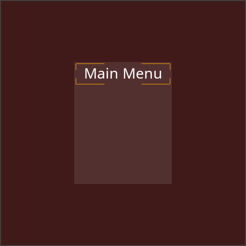
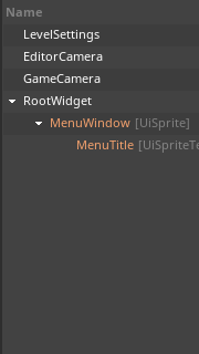
Main menu, continued, with hierarchy for reference
The menu's window is good to go.
Adding Buttons
Now to make our first button, the Start Game button. When we're done with it, we'll duplicate it three times and modify the duplicates to match the buttons we want the menu to have.
- In the
Library Window - Under Archetype
Left dragUiSpriteinto theObjects Window- In the
Objects Window Drag and droptheUiSpriteinstance on top of MenuWindow object- In the
Properties Window - Rename the UiSprite object to
StartGameButton - Under UiWidget
- Set LocalColor to
[R:255, G:255, B:255, A:0.10] - Under the Layout group
- Set SizePolicyX enum to
Flex - Set SizePolicyY enum to
Flex - Add Component : UiFillLayout
- In the
Library Window - Under Archetype
Left dragUiSpriteTextinto theObjects Window- In the
Objects Window Drag and droptheUiSpriteTextinstance on top of StartGameButton object- Rename the UiSpriteText object to
ButtonText - Under UiWidget
- Set the Y part of Size to
33 - Under the Layout group
- Set SizePolicyX enum to
Flex - Set VerticalAlignment enum to
Center - Under SpriteText
- Set Text to
Start Game - Set Font enum to
NotoSans-Bold - Set FontSize to
24 - Set TextAlign enum to
Center
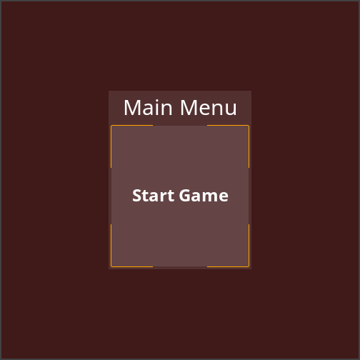
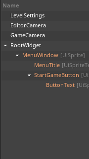
The main menu with the first button (work in progress), with hierarchy for reference
(NOTE) Why's Everything Orange? You may notice that some of the objects in the Objects Window are shown in orange text. Zilch uses this coloring scheme to denote an object that is //an instance of an archetype, but whose property values differ from the archetype it was created from//. Every object we've created so far has been instantiated from archetypes, which we then proceeded to modify. If you want an object's name to be printed in the same manner as the rest of the objects, just select it and clear its Archetype field in the Properties Window. Then it won't be considered an archetype instance anymore.
The button's outward appearance is mostly complete, but we need to give it a Nada component that gives it its functionality.
- Command : Add Resource
- Create a NadaScript resource using the Component template template and name it
LoadLevelOnClick - Update the
LoadLevelOnClickscript to the following:
class LoadLevelOnClick : NadaComponent
{
  [Property]
  var LevelToLoad : Level;

  function Initialize(init : CogInitializer)
  {
    Zilch.Connect(this.Owner, Events.LeftClick, this.OnLeftClick);
  }

  function OnLeftClick(event : ViewportMouseEvent)
  {
    this.Space.LoadLevel(this.LevelToLoad);
  }
}
Zilch's UI system sends the LeftClick event to every interactive widget object (that is, every game object whose UiWidget component's Interactive property is set to true) when it is left-clicked. This component uses that event to load a level of our choice, making it perfect for our menu buttons (and more). But in addition to the functionality offered by this component, we can also add some helpful feedback to the button with a couple more core Nada components: UiHighlight, which changes a button's color when it is hovered over or clicked on, and UiChangeCursor, which makes a button change the mouse cursor when it is hovered over.
- Select : StartGameButton object
- In the
Properties Window - Add Component :
UiHighlight - Add Component :
UiChangeCursor - Add Component :
LoadLevelOnClick - Under
UiHighlight - Set MouseHoverColor to
[R:255, G:255, B:255, A:0.20] - Set MouseDownColor to
[R:0, G:0, B:0, A:0.10] - Set AnimateTime to
0.06 - Under
UiChangeCursor - Set Cursor enum to
Hand
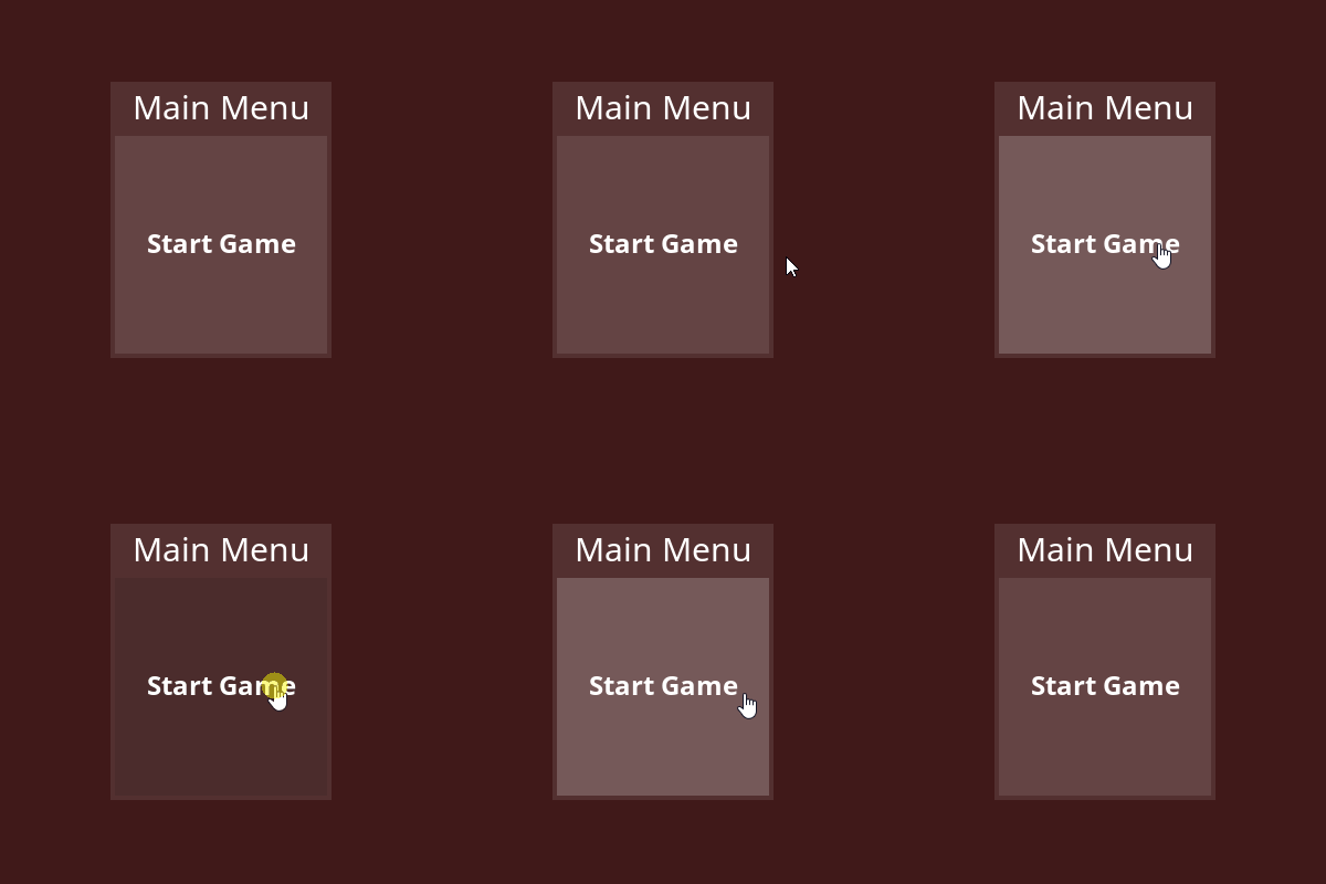
Now we'll just duplicate this button a few times.
- Duplicate : StartGameButton object three times
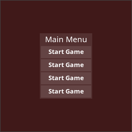
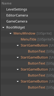
The menu with four copies of the Start Game button, with hierarchy for reference
- Set the Text properties of the SpriteText components of the ButtonText object objects to match the following:
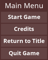
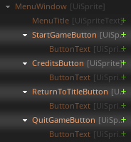
- Rename the StartGameButton object objects to match the following:
The menu is nearly complete; pretty much all that's left to do is to create the levels that the buttons will link to, and then hook them up.
Creating a Gameplay Level
We'll just throw something together real quick to make a gameplay level. It won't be anything to write home about, but it will be adequate for our needs.
- Command : Add Resource
- Create a Level resource using the {nav icon=clone, name="2D Level"} template and name it
GameplayLevel - Command : Add Resource
- Create a NadaScript resource using the Component template template and name it
KeyboardMovement - Update the
KeyboardMovementscript to the following:
class KeyboardMovement : NadaComponent
{
  [Dependency] var Transform : Transform;

  [Property]
  var Speed : Real = 8;

  function Initialize(init : CogInitializer)
  {
    Zilch.Connect(this.Space, Events.LogicUpdate, this.OnLogicUpdate);
  }

  function OnLogicUpdate(event : UpdateEvent)
  {
    var movement = Real3.Zero;

    if (Zilch.Keyboard.KeyIsDown(Keys.Right))
      movement += Real3.XAxis;
    if (Zilch.Keyboard.KeyIsDown(Keys.Left))
      movement -= Real3.XAxis;
    if (Zilch.Keyboard.KeyIsDown(Keys.Up))
      movement += Real3.YAxis;
    if (Zilch.Keyboard.KeyIsDown(Keys.Down))
      movement -= Real3.YAxis;

    this.Transform.WorldTranslation += movement * this.Speed * event.Dt;
  }
}
- Select : Renderer object
- In the
Properties Window - Under
ForwardRenderer - Set ClearColor to
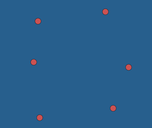
[R:51, G:89, B:128, A:1.00] - Command : CreateSprite
- In the
Properties Window - Rename the Sprite object to
Player - Add Component :
KeyboardMovement - Under Sprite
- Set VertexColor to
[R:204, G:82, B:82, A:1.00] - Set SpriteSource enum to
CircleBordered - Command : PlayGame
- Use the
Arrowkeys to move the Player object
In a moment, we'll make it possible to go to the gameplay level from the main menu, but while we're here, let's make it possible to exit to the menu from gameplay.
Going from Gameplay to the Main Menu
Let's make it so that the Escape (Escape) key takes us back to the main menu. Of course, by default, this key quits a Zilch game altogether. We'll use a combination of two new components to circumvent this functionality and replace it with our own.
- Command : Add Resource
- Create a NadaScript resource using the Component template template and name it
QuitHandler - Update the
QuitHandlerscript to the following:
class QuitHandler : NadaComponent
{
  function Initialize(init : CogInitializer)
  {
    Zilch.Connect(this.GameSession, Events.GameRequestQuit, this.OnGameRequestQuit);
  }

  function OnGameRequestQuit(event : GameEvent)
  {
    event.Handled = true;
  }
}
When Escape is pressed, the GameRequestQuit event is dispatched to the GameSession object. If this event is not handled, the game exits. This component allows us to prevent this.
- Command : Add Resource
- Create a NadaScript resource using the Component template template and name it
LoadLevelOnKeystroke - Update the
LoadLevelOnKeystrokescript to the following:
class LoadLevelOnKeystroke : NadaComponent
{
  [Property]
  var Key : Keys = Keys.Escape;
  [Property]
  var LevelToLoad : Level = Level.MainMenu;

  function Initialize(init : CogInitializer)
  {
    Zilch.Connect(Zilch.Keyboard, Events.KeyDown, this.OnKeyDown);
  }

  function OnKeyDown(event : KeyboardEvent)
  {
    if (event.Key == this.Key)
      this.Space.LoadLevel(this.LevelToLoad);
  }
}
This component loads the specified level when the chosen key is pressed. With these two components, we can go from the gameplay level back to the main menu.
- Select : LevelSettings object
- In the Properties Window
- Add Component :
QuitHandler - Add Component :
LoadLevelOnKeystroke - Command : PlayGame
- Press
Escapewhile playing theGameplayLevelLevel resource
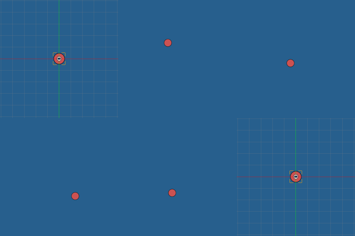
It's now possible to go from gameplay to the main menu
Pressing Escape while in the gameplay level now takes you to the main menu; pressing it again from there will quit the game.
NOTE: We've placed the QuitHandler component on the LevelSettings object object in the gameplay level, so that's the only level where the Escape key won't quit the game. To suppress Zilch's default Escape-to-quit behavior in other levels, add a QuitHandler to their LevelSettings object (or another object in the level). To prevent it on a broader scale still, add it to the Space object or even the GameSession object.
Now to hook up the main menu to go into the gameplay level.
Going from the Main Menu to Gameplay
- In the
Library Window - Open the Library enum list menu
- Select your project's library
- Under the Level tag
- Open the
MainMenuLevel resource - Select : StartGameButton object
- In the
Properties Window - Under
LoadLevelOnClick - Set LevelToLoad enum to
GameplayLevel - Command : PlayGame
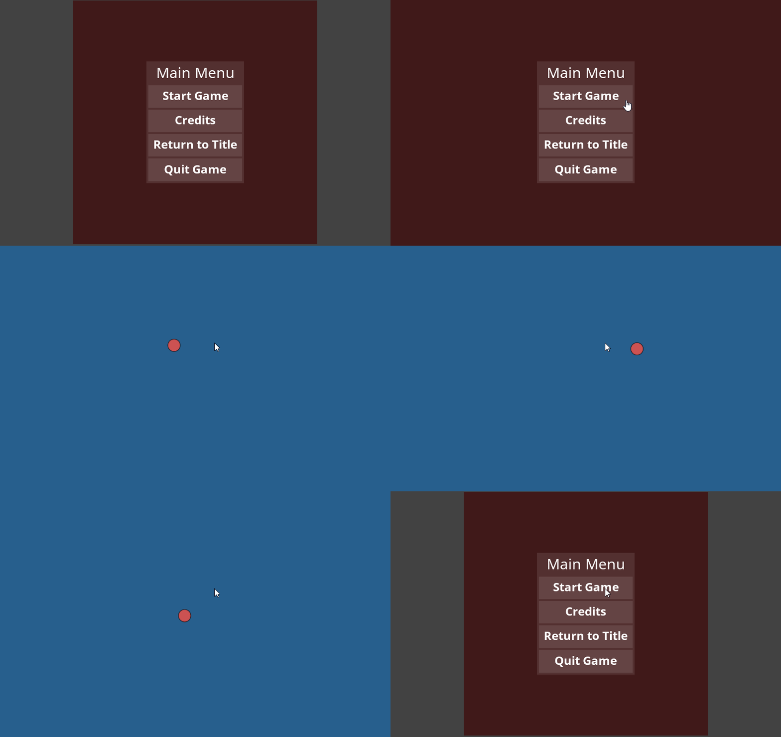
Clicking the Start Game button now loads the gameplay level, from where the Escape key can be used to return to the main menu.
We're almost done. Next up: a credits screen.
Creating a Credits Screen
The credits screen will be a modified copy of the main menu, so we can begin by duplicating the MainMenu level. Then we'll open the copy and make our changes to it.
- In the
Library Window - Under the Level tag
- {nav icon=mouse-pointer, name="Right click"} the
MainMenuLevel resource - Select Duplicate to create a copy of
MainMenu - Rename the
MainMenuCopy1Level resource toCredits - Open the
CreditsLevel resource
The credits will be displayed in a window like the main menu's menu window, but with only one button at the bottom that will go back to the main menu.
- Select : RootWidget object
- In the
Properties Window - Under UiRootWidget
- Set LocalColor to
[R:64, G:25, B:51, A:1.00] - Delete : CreditsButton object, ReturnToTitleButton object, and QuitGameButton object
- Select : MenuTitle object
- In the
Properties Window - Under SpriteText
- Set Text to
Credits - Select : StartGameButton object
- In the
Properties Window - Rename the StartGameButton object to
MenuButton - Under UiWidget
- Under the Layout group
- Set SizePolicyY enum to
Fixed - Set the Y part of Size to
40 - Under
LoadLevelOnClick - Set LevelToLoad enum to
MainMenu - Select : ButtonText object
- In the
Properties Window - Under SpriteText
- Set Text to
Return to Main Menu - Set FontSize to
16 - Under UiWidget
- Set the Y part of Size to
22
Now we're going to explore a concept we haven't touched yet: giving a widget object a size policy of Auto.
- Select : MenuWindow object
- In the
Properties Window - Under UiWidget
- Under the Layout group
- Set SizePolicyY enum to
Auto
A widget object with a layout component, like UiStackLayout, can resize itself when laying out its children. The Auto size policy causes such a layout to make itself as small as necessary to accommodate all of its fixed-sized contents, including its padding and spacing, the margins of its child widgets object, and any of those children that use the Fixed size policy. In the case of the credits window, it contains only two direct children, each of which is Fixed on the Y axis. Their Y size plus the padding and spacing of the window's layout determines the Y size of the window:
MenuTitle object has a Fixed Y Size of 41
MenuButton object has a Fixed Y Size of 40
MenuWindow object has a PaddingTop of 4
MenuWindow object has a PaddingBottom of 4
MenuWindow object has a Y Spacing of 4
These all add up to 93, which is exactly the height of the window.

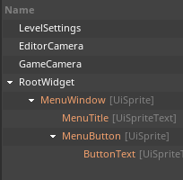
The credits window, with its SizePolicyY enum set to Auto, with hierarchy for reference
The credits will be displayed between the menu title and the button. We'll place them in a UiStackLayout that we can make by starting with the UiSprite archetype. We'll remove its Sprite component, though, so that it's just an invisible layout area. We'll set its SizePolicyY enum to Auto, so that it can grow to fit every credit we add.
- In the
Library Window - Open the Library enum list menu
- Select the
UiWidgetlibrary - Under Archetype
Left dragUiSpriteinto theObjects Window- In the
Objects Window Drag and droptheUiSpriteinstance between MenuTitle object and MenuButton object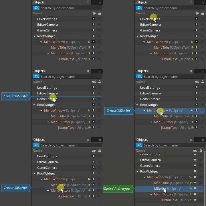
- In the
Properties Window - Rename the UiSprite object to
CreditsBlock - Remove Component : Sprite
- Under UiWidget
- Under the Layout group
- Set SizePolicyX enum to
Flex - Set SizePolicyY enum to
Auto - Add Component : UiStackLayout
The credits block should be a vertically stacked list, so we're using a UiStackLayout. Each element of the list is a pair of two things: a role (to be shown on the left) and the people who held that role on your game (to be shown on the right). Thus, each credit is itself a stack layout. (As we'll soon see, the list of people will also be yet another stack layout.)
- Select : CreditsBlock object
- Command : Duplicate
- In the
Properties Window - Rename the copy of CreditsBlock object to
CreditListing - Attach CreditListing object to CreditsBlock object
- Select : CreditListing object
The credits should be stacked vertically, but within each listing, the role should be listed to the left of the names of the people, so the stack direction of this new widget object needs to change.
- In the
Properties Window - Under UiStackLayout
- Set StackDirection enum to
LeftToRight
Each credit listing will contain a role, which will be a simple text widget object, and a list of people, which will be another stack layout, like the listing itself. Before we add the role text widget object, let's duplicate the credit listing widget object and modify it to become the list of people. Afterward, we can add the role text.
- Select : CreditListing object
- Command : Duplicate
- In the
Properties Window - Rename the copy of CreditListing object to
ListOfPeople - Attach ListOfPeople object to CreditListing object
- Select : ListOfPeople object
The names of the people should be stacked vertically, and they should be centered vertically as well, just in case the name of the role takes up more vertical space than the list of people.
- In the
Properties Window - Under UiStackLayout
- Set StackDirection enum to
TopToBottom - Under UiWidget
- Under the Layout group
- Set VerticalAlignment enum to
Center
Now we'll add the role text. It'll be the first element in the credits block with a Fixed height, so we'll finally be able to see something! The role will be displayed on the left side of the credit listing, but it will be aligned to the right.
- In the
Library Window - Under Archetype
Left dragUiSpriteTextinto theObjects Window- In the
Objects Window Drag and droptheUiSpriteTextinstance on top of CreditListing object- Reorder the children of CreditListing object so that UiSpriteText object is before ListOfPeople object
- In the
Properties Window - Rename the UiSpriteText object to
Role - Under UiWidget
- Set the Y part of Size to
16 - Under the Layout group
- Set SizePolicyX enum to
Flex - Set VerticalAlignment enum to
Center - Under SpriteText
- Set Text to
Role - Set TextAlign enum to
Right
We'll fill in the actual name of the role later. First, let's put some placeholder names in the corresponding list of people. Each name will be displayed on the right side of the credit listing, but it will be aligned to the left.
- Select : Role object
- Command : Duplicate
- In the
Properties Window - Rename the copy of Role object to
Person - Attach Person object to ListOfPeople object
- Select : Person object
- Under SpriteText
- Set Text to
Name - Set TextAlign enum to
Left
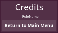
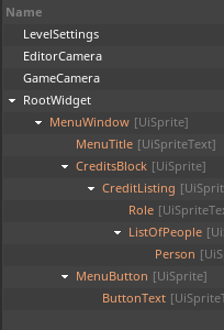
A credit listing, with placeholder text, with hierarchy for reference
The role and the person's name don't have any room between them. This can be corrected with the Spacing property of the layout they're in.
- Select : CreditListing object
- In the
Properties Window - Under UiStackLayout
- Set the X part of Spacing to
16
That looks better. Let's also duplicate the placeholder name, to see how it will look when more than one person is credited for the same role.
NOTE: Both of the above Duplicate commands should be executed.
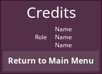
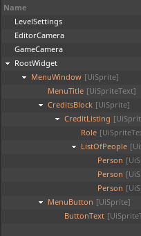
A credit listing, with multiple names for the same role, with hierarchy for reference
That looks pretty good. Now let's duplicate the credit listing.
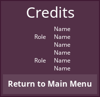
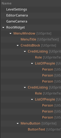
Two credit listings, with bad spacing, with hierarchy for reference
The names run on together so that they look like they're one big list. Again, this problem can be solved by the Spacing property.
- Select : CreditsBlock object
- In the
Properties Window - Under UiStackLayout
- Set the Y part of Spacing to
12
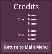

Two credit listings, with good spacing, with hierarchy for reference
That looks much better. Now we can replace all the placeholder text.
- Duplicate the CreditListing object cogs so that there are enough of them for the credits for your game
- Set the Text properties of the SpriteText components of the Role object objects to the names of the roles for your game
- Set the Text properties of the SpriteText components of the Person object objects to the names of the people in the corresponding roles
If any of the names of the roles or team members in your credits extend onto multiple lines, just increase the Y part of the Size property of the UiWidget component of that name's widget object (say, by doubling it). Alternatively, you could also widen the whole window by increasing the X part of the Size property of the UiWidget component of the MenuWindow object object.
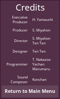

A complete credits screen, with hierarchy for reference
Final Connections
We're almost done! There are just a few more things to hook up, and one more quick component to make. For now, let's return to the main menu.
- In the
Library Window - Open the Library enum list menu
- Select your project's library
- Under the Level tag
- Open the
MainMenuLevel resource - Select : CreditsButton object
- In the
Properties Window - Under
LoadLevelOnClick - Set LevelToLoad enum to
Credits - Select : ReturnToTitleButton object
- In the
Properties Window - Under
LoadLevelOnClick - Set LevelToLoad enum to
TitleScreen
The quit button still has its old LoadLevelOnClick component from its days as a start button clone. We can remove that, and also add a new component that quits the game on click:
- Command : Add Resource
- Create a NadaScript resource using the Component template template and name it
RequestQuitOnClick - Update the
RequestQuitOnClickscript to the following:
class RequestQuitOnClick : NadaComponent
{
  function Initialize(init : CogInitializer)
  {
    Zilch.Connect(this.Owner, Events.LeftClick, this.OnLeftClick);
  }

  function OnLeftClick(event : ViewportMouseEvent)
  {
    this.GameSession.RequestQuit();
  }
}
- Select : QuitGameButton object
- In the
Properties Window - Remove Component :
LoadLevelOnClick - Add Component :
RequestQuitOnClick
There's just one more thing to do: make the title screen go to the main menu.
- In the
Library Window - Under the Level tag
- Open the
TitleScreenLevel resource - Select : RootWidget object
- In the
Properties Window - Add Component :
LoadLevelOnClick - Under
LoadLevelOnClick - Set LevelToLoad enum to
MainMenu - Command : PlayGame
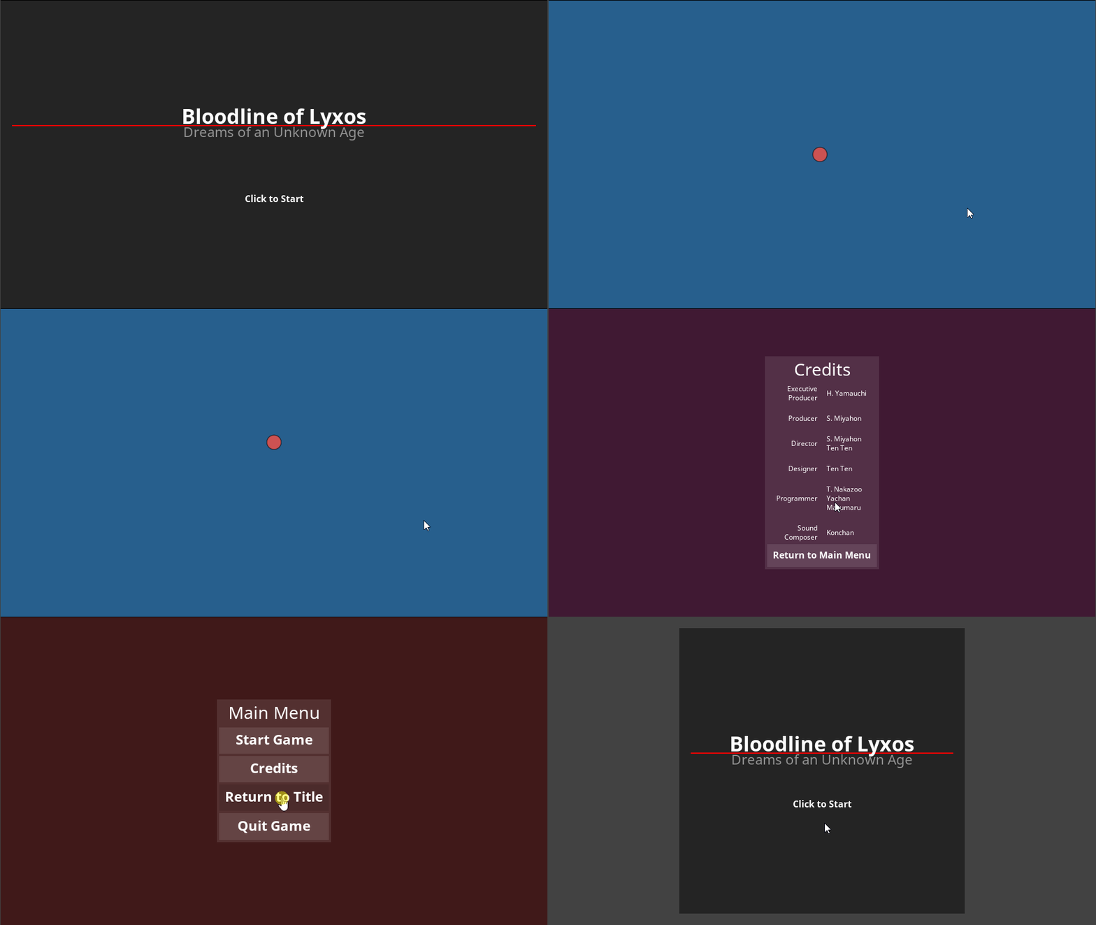
All of the game's levels and screens are now connected
The game is now complete. Clicking on the title screen leads to the main menu; the main menu's Start Game button leads to the gameplay level; pressing Escape from gameplay leads back to the main menu; clicking the main menu's Credits button leads to the credits screen; clicking the credits screen's Return to Main Menu button leads back to the main menu; clicking the main menu's Return to Title button leads back to the title screen; and finally, clicking the main menu's Quit Game button quits the game.
Related Materials
Tutorials
Manual
Reference
Commands
Classes
Events
Enums
Development Task
- T1186